When it comes to translating powerful data insights into a format that people can dig into, there’s a big difference between visualization and storytelling.
Or, to be more specific, data visualization is a part of storytelling. But it’s a very common mistake to think that visualizing data and telling a story with data are exactly the same thing.
They’re not.
Consider: when you look at a chart or graph, you understand what it means to convey to you. You are able to translate the information from a readily available and observer-friendly format in order to gain understanding as to the topic at hand.
But does that necessarily make you want to take action? Does it engage you? Or does it just tell you what it means and leave it right there?
Chances are your engagement begins and ends with understanding. That’s visualization — and it is an absolutely necessary component of filtering out big data into a format that people can actually use to make good business decisions. But it’s not the beginning and end.
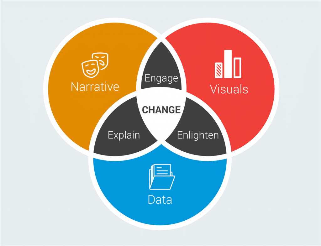
In order to use data visualization as a mode of storytelling, it must capture the attention of the viewer in a way that motivates action. It should inspire movement and provoke the desire to take part in something, whatever project, decision or movement is at hand.
So how can you use visualization to create a story?
Craft a story using data analysis
Creating a story out of data is just like creating a story out of words, photos or films. In order to capture the attention of your audience, you want to provide context information as to why this information matters, introduce challenges that the information seeks to resolve, introduce urgency with timelines and time-sensitive issues, and drive home the crux of your message.
Powerful storytellers weave in personal information and anecdotal commentary when presenting visualized data in order to convert charts and graphs from static representations to engaging, dynamic elements of the story.
You can use common creative storytelling devices like comparisons and contrasts to define your position, identify the overall mission and make a personal connection with the audience in order to infuse real-life meaning into the data being presented.
In a business or professional setting, it’s all too easy to make the mistake of believing that you must leave yourself altogether out of your presentation, that you should not make it personal in any way, that you should leave the business talk to all business. But for the purposes of storytelling in a business setting: that couldn’t be further from the truth.
What converts data from just a visual presentation to a story is, in fact, the personal connection you make with the people who view it. Make good use of the opportunity to create real connection in order to turn your data into a powerful storytelling device.
Unlimited subscription £49.99
Now only £35
For Limited Period
READY TO DIVE DEEPER?
One subscription, unlimited UK Company search and downloads.
Sign up to a simple membership plan that gives you unlimited access to predefined dashboards allowing for different analysis and views into critical sales and business intelligence.
Related Posts
February 19, 2024
Ownership insights with DataEco With recent news of tighter legislation being passed through the house of parliament the question that a lot of [...]
February 19, 2024
September 6, 2021
Check a Company Competitors with DataEco So how do you rank? With a lot of emphasis on survival in the last year, many companies [...]
September 6, 2021
May 19, 2021
Companies House Check with DataEco So what is the importance of Companies House? As the UK Company Regulator , it is the [...]
May 19, 2021
December 8, 2020
Ltd Company Check with DataEco So why do we have Limited companies and what is the difference? A ‘Ltd’ or ‘Limited’ company is [...]
December 8, 2020
November 30, 2020
Check UK Company Name with DataEco Save time, energy, and sanity with the only platform you need for finding reliable company data [...]
November 30, 2020
November 18, 2020
UK Company Search The way to perform a UK Company Search depends on the tools you use and how the data has been [...]
November 18, 2020
November 16, 2020
B2B Data Providers There has always been B2B data providers in UK in some form or another. The early days of acquiring mailing [...]
November 16, 2020
November 12, 2020
UK Economy Bounces Back Well it was the signs that we were looking for and for sure the UK Economy is bouncing back. [...]
November 12, 2020
October 29, 2020
UK Companies and Industries at Risk Well it' been a torrid year for all and the uncertainty of which UK Companies and Industries [...]
October 29, 2020
May 14, 2020
Segmentation of UK businesses A quick browse of the internet reveals countless articles and pages on ‘Marketing Segmentation’. Very few seem to focus [...]
May 14, 2020

